
I have worked on company and product websites, including their frontend implementation, copy, illustrations, and interaction details. Two of these were a company-site redesign and the LeapAll landing page.
Company site: match each problem with its answer
When I took over an iteration in August 2026, a colleague had already turned presentation material into the main pages. There was plenty of information, but its hierarchy was difficult to follow. My work covered layout, motion, copy, and illustrations.
A product page originally listed several pain points. I changed it into a scroll-controlled comparison. The problems appear on the left; scrolling fades them to gray, draws a strike-through, introduces an arrow, and reveals the corresponding answer on the same row. The heading changes with the section.
Keeping the problem in place means the reader can see the relationship without remembering a previous screen. GSAP ScrollTrigger coordinates the heading, lines, arrows, and answers on one timeline. Strike-throughs extend slightly beyond the final character, scaled with the font size. Arrows finish before the answer is fully revealed, reinforcing the direction from problem to response.
The first version held the screen too long and had a delay before anything happened. I shortened both the total scroll distance and the timeline's empty intervals. Reducing animation duration alone would merely distribute the motion across the same scroll distance.
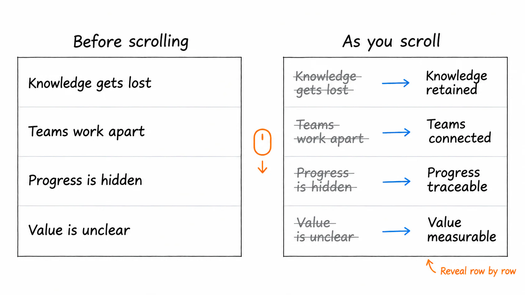 Design sketch of the company-site interaction: each problem stays aligned with its solution
Compare alternatives inside the complete page
Enlarging the middle of three product cards created variation, but could make the other products appear secondary. I compared alternatives in a Dev Lab that retained the whole page and changed only the section under discussion.
Once the homepage direction was settled, I aligned spacing, buttons, and imagery across the other pages. Button feedback became a short movement and color change rather than an inconsistent mixture of glows and shadows. Some relationships worked better as text, icons, and arrows in the page than as a dense illustration.
Navigation needed checks against each background too. It blends into the homepage hero, then becomes a pill attached to the top edge after scrolling. On the team photograph, the logo, overlay, and text needed adjustment together to stay readable.
A demonstration should show a task happening
An early product demonstration changed between scenes but still resembled a slide deck. I reorganized a cross-department example around one task: a department requests work, an agent passes it to sales, the same task appears in the next conversation, and a draft file returns.
The department list, conversation, and result follow that process. Task cards appear directly, replies stream in, completed thinking folds away, and files remain long enough to read. When a candidate interface differed too much from the real product, I reduced it to the elements needed to explain the handover.
LeapAll: see the download button before covering the hero
LeapAll introduces file processing and PPT, image, and video generation to everyday computer users. For its landing page in May 2026, I used a large hero that is gradually covered by the body, with navigation expanding from a centered brand into section links.
A short desktop window exposed a problem: fixing the hero immediately could let the body cover it before the download button was visible. The hero now scrolls until its bottom enters view, then becomes fixed. An outer placeholder retains its height so the body does not jump when positioning changes.
Automatic and manual navigation states are separate. A menu opened manually in the hero should not close on a small scroll; control returns to scrolling after the body is entered. Different opening and closing thresholds prevent repeated toggling at one boundary.
A request on the left, its execution on the right
Scenario demonstrations use a narrow chat column and a wider LeapAll interface. The chat explains the incoming request; the application shows input, processing, and a result. A competitive-analysis scene ends with PPT pages, while an image scene shows a poster rather than another generic completion message.
Messages, typing, sending, and results follow a shared playback position. Pause stops them together, resume continues from the remaining time, and changing scenes resets both the demonstration and progress bar. Old timers are cleared so the previous scene cannot change the next one. The progress bar cannot simply run an unrelated CSS animation.
Copy focuses on user actions. A capability section moved from “five capability domains” to the idea of going from a sentence to a finished deliverable, followed by concrete research, file, and output tasks. I also read groups of descriptions together to avoid repetitive sentence patterns.
Downloads changed from four adjacent platform buttons to one device-appropriate primary button and an other-platforms menu. A development panel can simulate systems, pause the demonstration, and expose intermediate states without repeatedly switching devices.
Company-site design notes · LeapAll design notes · LeapAll
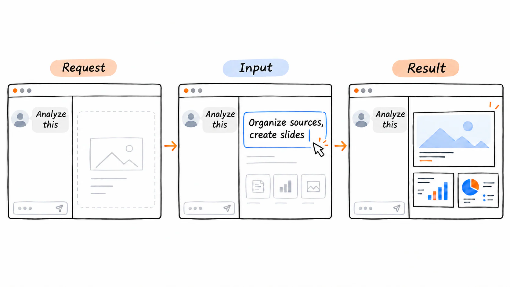 The three stages of a LeapAll scenario: request, input, and result